Menu
Product & design
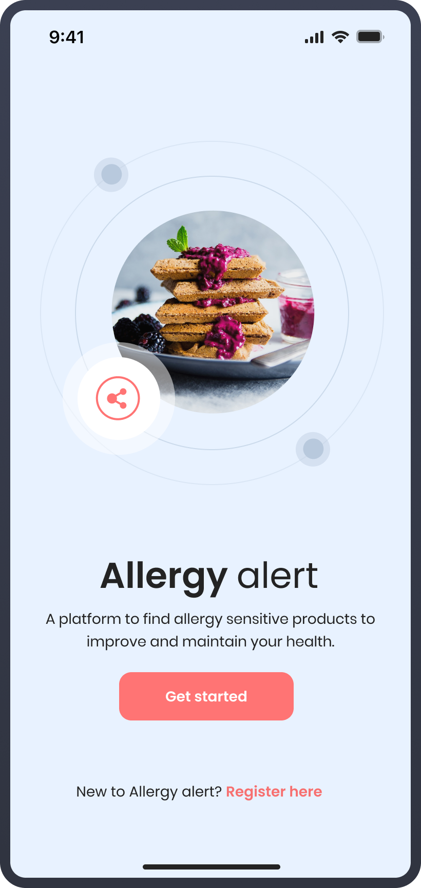
Allergy Alert
Allergy Alert is a practical app designed to help allergy sufferers discover safe products in local stores, making shopping easier and more convenient.
Allergy Alert
Project introduction
The challenge
For people with specific allergies, shopping for safe products in local stores can be a daunting and time-consuming task. Many individuals struggle to find suitable products that meet their allergen requirements, often leading to frustration and anxiety during shopping trips. Without a reliable source of information, they may have to visit multiple stores or spend significant time reading product labels to ensure their safety. This process not only adds stress to their lives but also hinders their ability to confidently embrace a normal shopping routine.
The solution
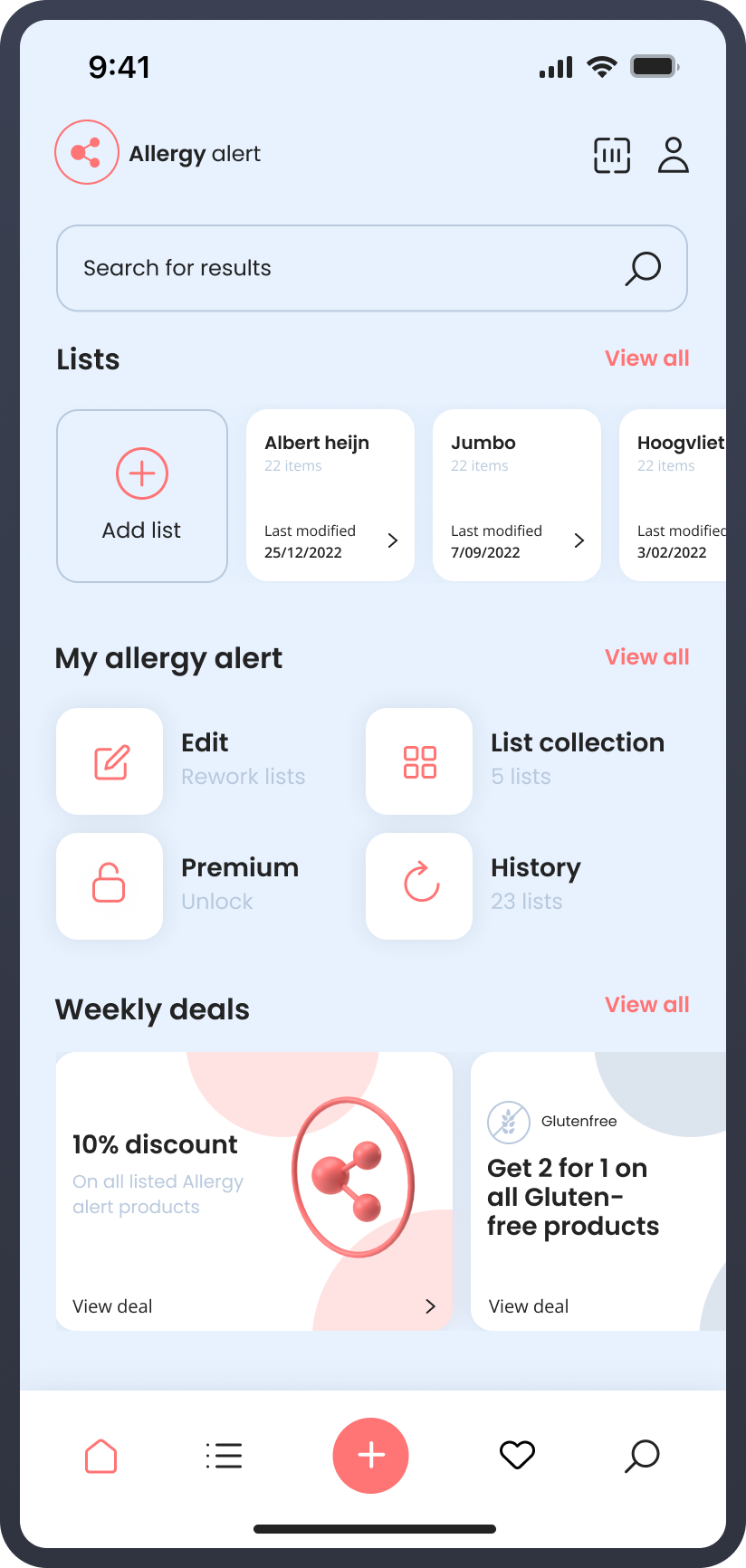
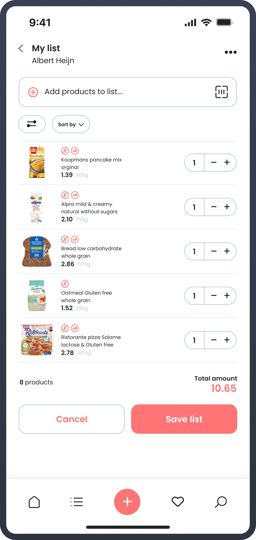
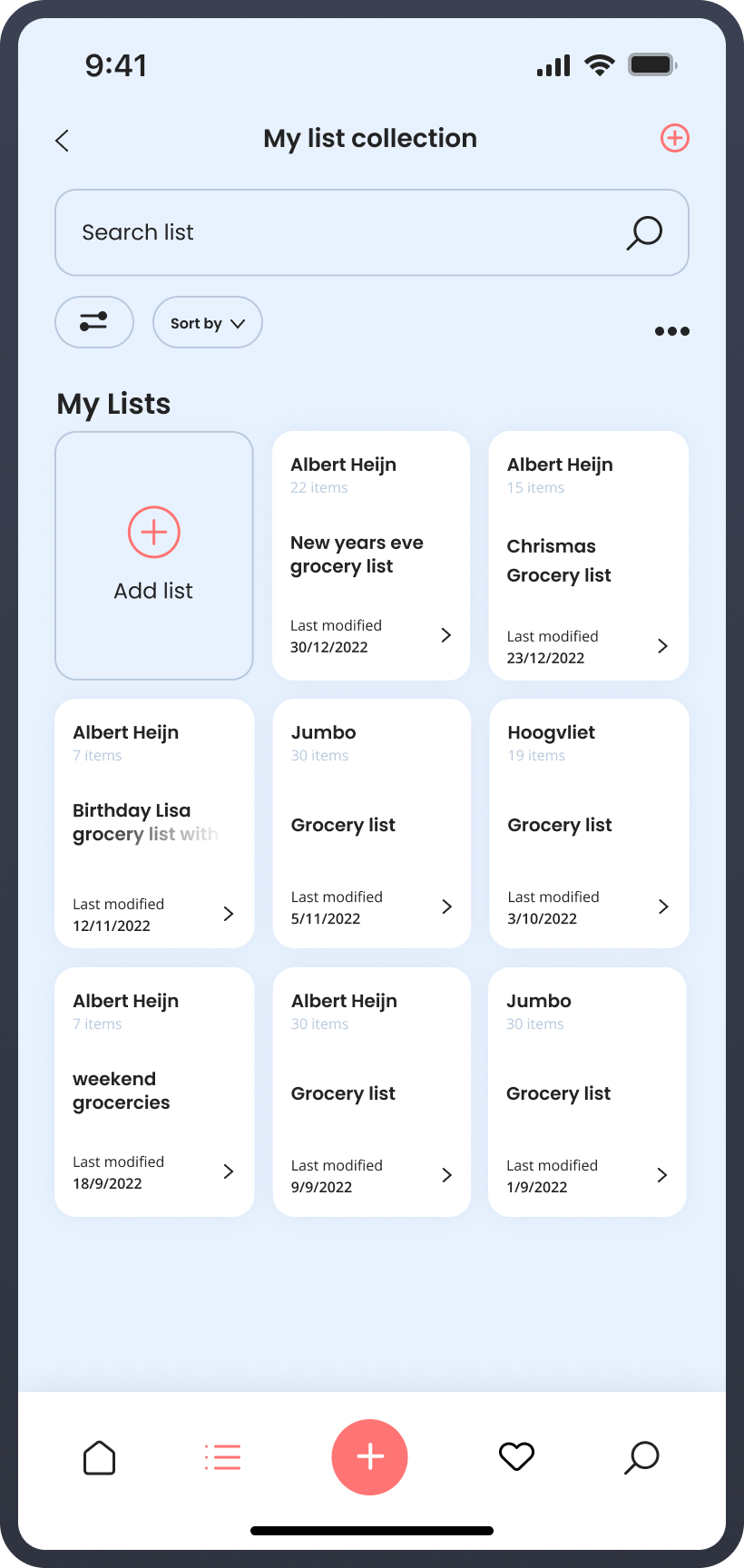
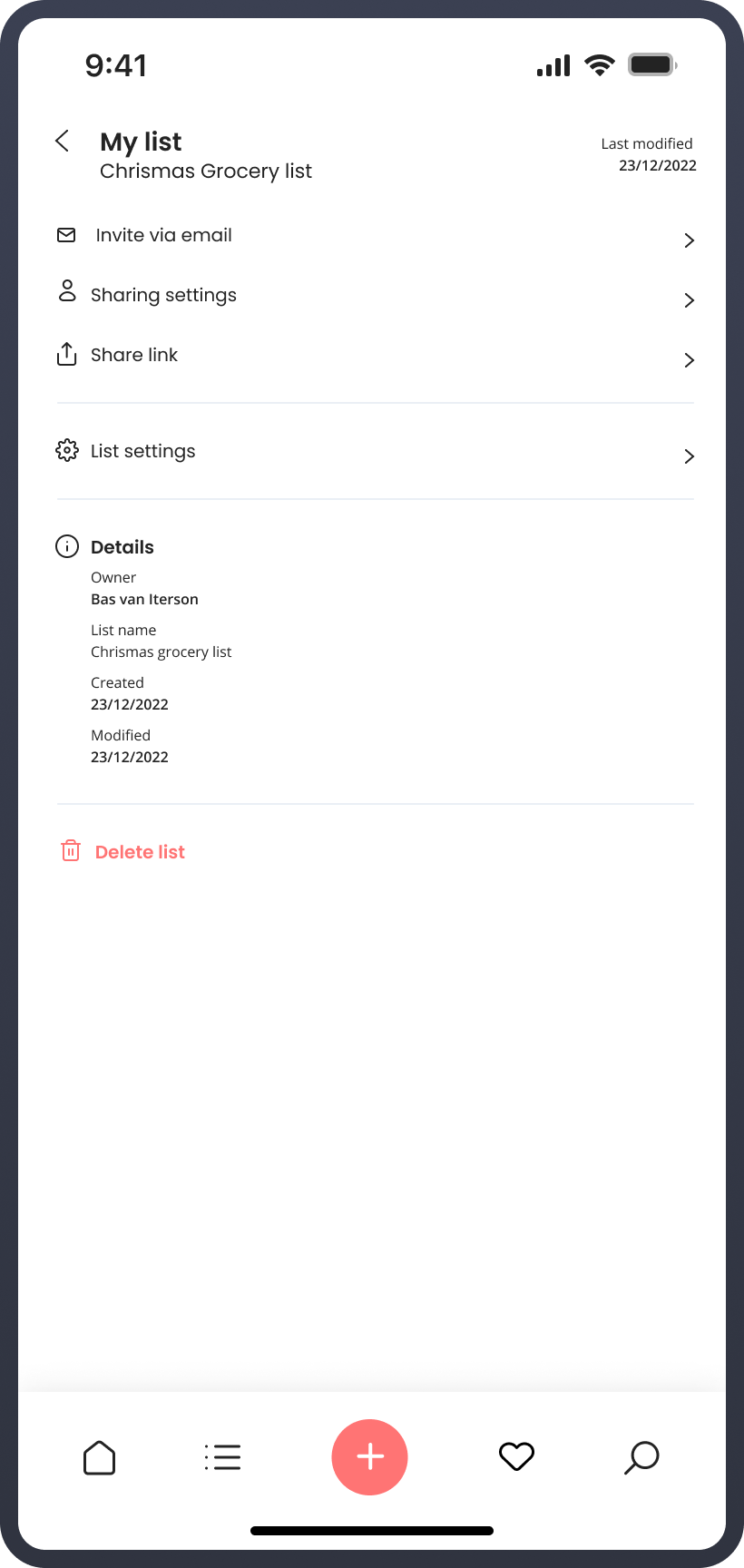
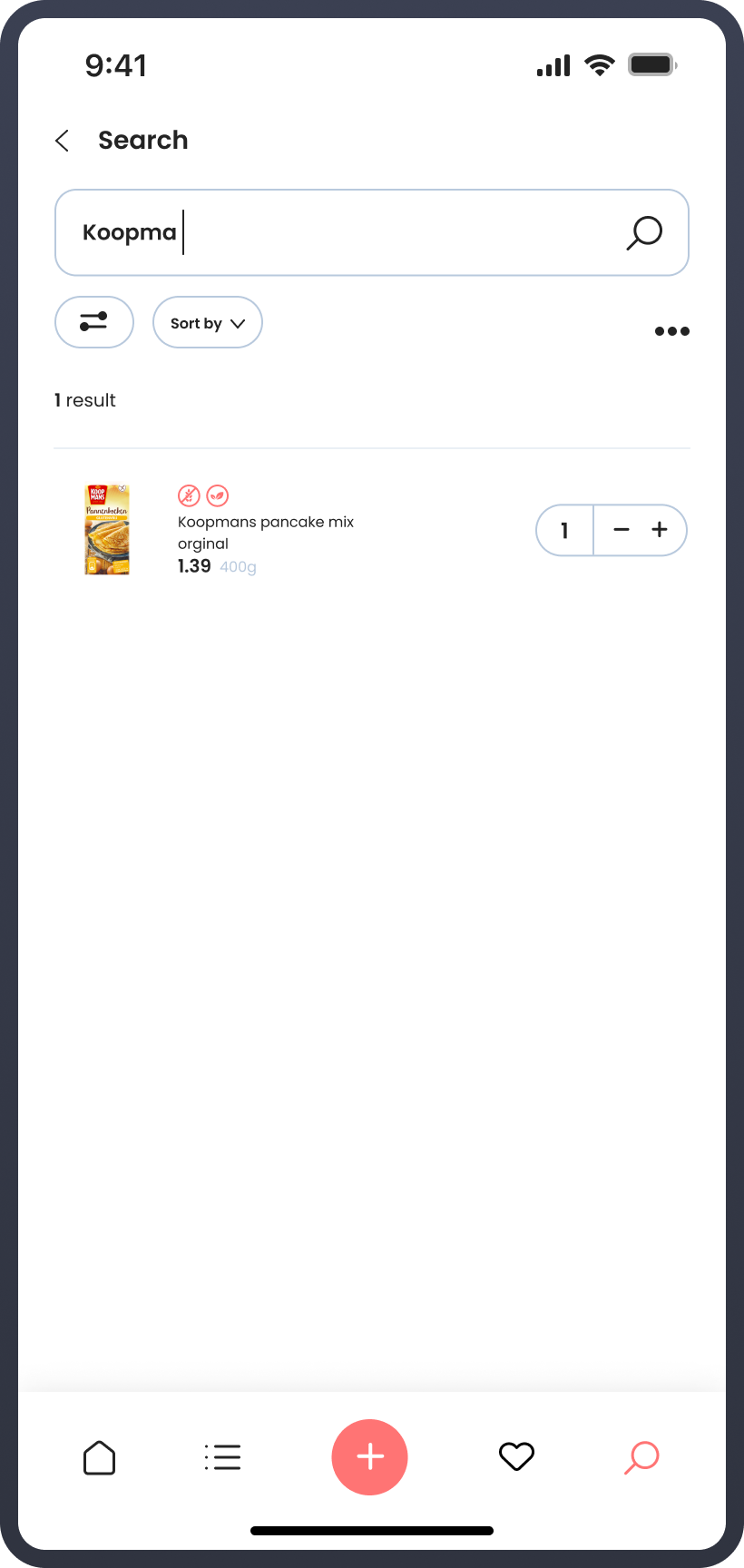
Enter Allergy Alert, the practical app designed with allergy sufferers in mind. This innovative solution aims to simplify the shopping experience for users with specific allergies by providing a comprehensive database of approved products available in particular stores within their area. With Allergy Alert, users can effortlessly create and access a personalized list of safe products tailored to their specific allergen requirements. By having access to this valuable information at their fingertips, users can now shop with convenience and confidence, knowing that the app will alert them to suitable products in their selected stores.
The highlighted progression that led to the final product
phase 01
Concept ideation
Final concept
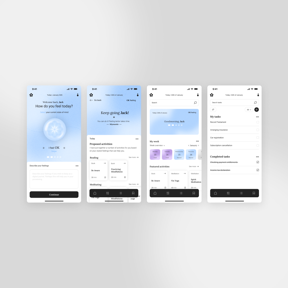
Introducing Allergy Alert - the practical app designed for people with specific allergies, which alerts the user about the products available in particular stores in their area. I was inspired by those around me who struggled to find safe products in local stores and wanted to provide a solution to compare and discover products available in each store specifically. With this app, users can create a list of approved products available nearby at selected stores, making shopping easier for allergy sufferers. Embrace a life of convenience and confidence with Allergy Alert!
phase 02
Visual design
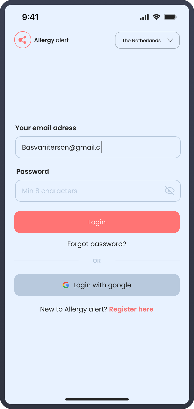
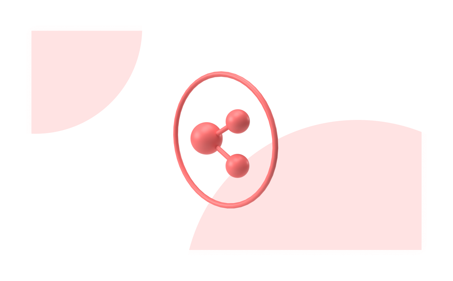
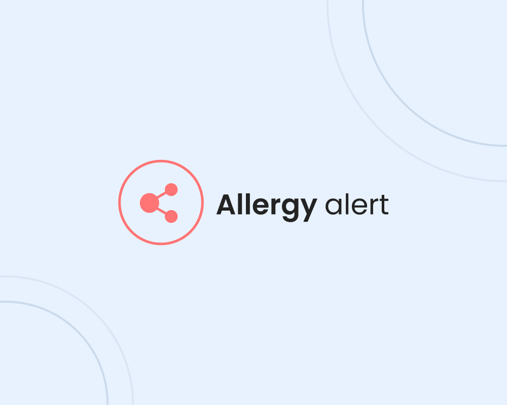
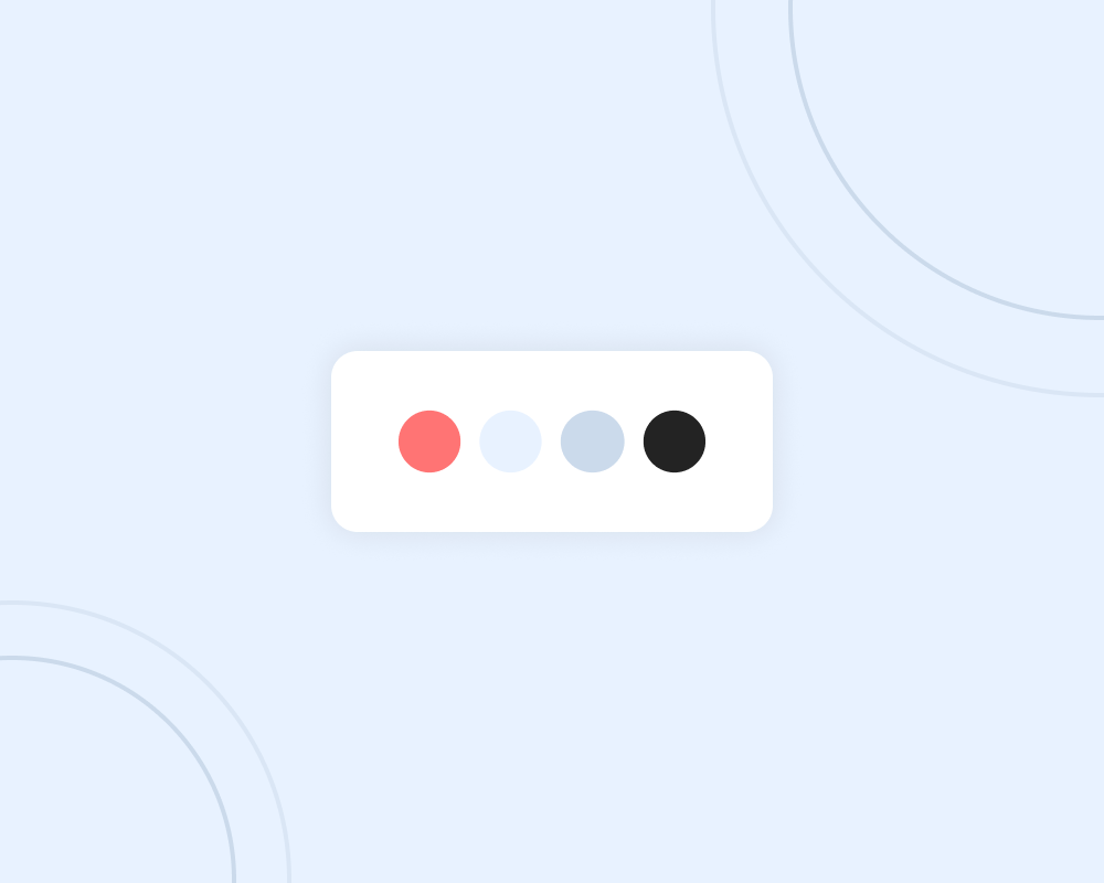
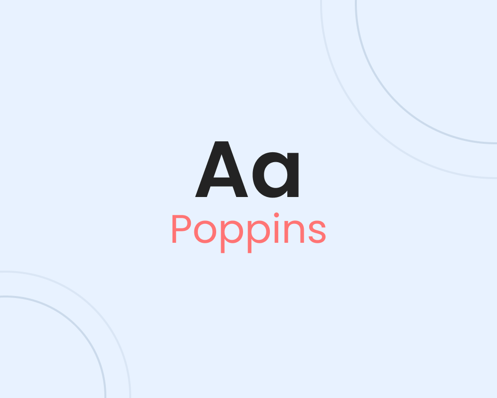
By creating the brand for the Allergy Alert concept I implemented a visual style that fits the needs of the end-users. The branding consists of multiple visual elements. In the visual imagery, I've designed a logo that represents a Molecule. the red circle around it indicates a warning message. The icon is not only used as an icon but also as a 3D visual created in Adobe Dimensions. For the colors, I've used the 60/30/10 color rule to create a color palette for this app. As a dominant color white is partially used as a background color. As a secondary accent color, I've used blue to convey safety and security for the users while using Allergy Alert. The accent color red is used to convey that the app gives you an alert on products that aren't safe for people with dietary needs in the form of informational icons with the product. This color also gives a clear contrast with the secondary color blue. The Google font Poppins is used to increase readability and clarity. The font fits well with the app where the smaller font sizes within the interface are still readable by the geometric shapes used in Poppins.

afterwards
Reflection
Learnt lesson
Using excisting color contrasts while creating a visual branding. For future projects, I will use excisting color contrast patterns for optimal readability and visual appearance.
next project